Resolution Bumping Shaded Relief
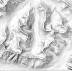
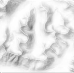
As Tom Patterson describes in "Resolution bumping GTOPO30 in Photoshop", using a too-detailed shaded relief image can actually yield a map which is less legible. In the same article Patterson also demonstrates how to counteract this problem. He says this is something to do to the elevation model and not the shaded relief, but not having a graphics program installed on my machine capable of editing 16 bit images I applied it to the shaded relief instead. The results are good, but I'm itching to try it out properly to see what the difference is when used earlier in the chain. Here is my nutshell re-work of Patterson's resolution bumping technique.
Load the relief image in GIMP:
- duplicate layer
- upper layer == the detail layer, leave alone, set Mode to Overlay
- bottom == the shape layer, apply Gaussian blur with setting 20
- save a copy (relief_blurred.tif)
Re-assign projection:
gdalcopyprojshaded_relief.tif relief_blurred.tif
The order of the upper and lower layers makes a difference. When upper is the detail layer the result is brighter and has more of a ghostly glow, whereas when the bottom is the detail layer the results are not as dramatic.

date: 2009-10-20
tags: [projects, gis]
category: Projects